
Why This Popular Health Brand Gave Up on 'Healthy' to Survive—What They Discovered Will Shock You!
Launching a healthy snack brand in today's market can feel like an uphill battle. Take the case of Eat Real, a company that found itself in a challenging position despite offering innovative products. Their snacks are made from pulses and grains instead of traditional fried potatoes, and they are baked rather than fried. With impressive credentials, one would think their products would be flying off the shelves. Instead, they struggled with low awareness and inconsistent messaging, leaving potential customers confused about when and why to choose their snacks.
The core issue? When Eat Real emphasized its health benefits, many consumers perceived the brand as “worthy but dull.” In a world where snacks often evoke indulgence and enjoyment, a health-first approach can feel more like a lecture than a treat. The dilemma is familiar: standing before a store at 3 PM with a craving for something crunchy, the allure of a sweet Twix often overshadows a healthier option.
A Shift in Focus
Recognizing this disconnect, the London agency Midday Studio proposed a radical yet effective strategy: shift the focus from health to taste. This pivot highlights a crucial element of consumer psychology—people want to enjoy their snacks without the accompanying guilt. By framing their products as delicious treats rather than health foods, Eat Real could transform consumer perceptions and buying behaviors.
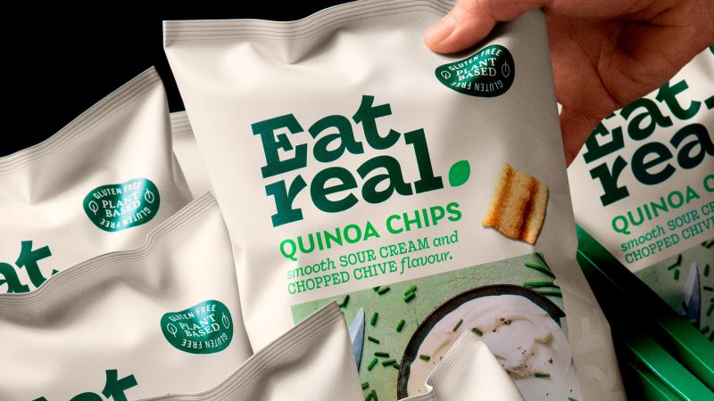
The design overhaul further reflects this repositioning. Midday Studio looked to cookbooks for inspiration, utilizing vibrant colors and captivating images of fresh, imperfect vegetables and fruits. This approach centers around sensory pleasure rather than calorie counts or nutrition labels, making the products visually appealing and inviting to consumers. As Claudio Vecchio, creative partner at Midday Studio, notes, the new imagery communicates goodness without sounding preachy.
The tone of voice in their marketing materials has also evolved, featuring appetizing descriptions that evoke the feeling of dining at a favorite restaurant instead of adhering to a strict dietician’s recommendation. This change aims to create a more enjoyable shopping experience for consumers, eliminating the stigma often associated with healthy snacking.
Moreover, Eat Real’s product range is quite complex, featuring four different chip bases—hummus, quinoa, lentil, and veggie—each with multiple flavors. The previous packaging design did little to help shoppers navigate this variety. Midday’s redesign establishes a clear hierarchy, making it easier for consumers to understand their options while maintaining brand coherence. The new logo incorporates modern, organic elements that signal a fresh start while retaining enough familiarity to keep existing customers engaged.
The rebranding efforts are evident across all touchpoints, from in-store displays to social media campaigns, all encapsulated in the inviting slogan “Love Food? Eat Real.” This tagline serves as an invitation to indulge rather than a directive to adhere to health standards, emphasizing enjoyment over obligation.
The snack industry is fiercely competitive, dominated by large companies with substantial marketing budgets. Challenger brands like Eat Real must find ways to present themselves as desirable alternatives to more indulgent options. The strategy employed by Midday Studio exemplifies a broader trend in food marketing: prioritize taste and enjoyment over health claims. It’s a bold move, especially in an era where consumers often seek out healthier options but may still feel guilty about indulging.
In summary, the journey of Eat Real underscores a vital lesson for brands in the better-for-you food space: while health credentials are important, they should serve as a supporting actor, not the lead. As consumers, we are drawn to the promise of enjoyment. By focusing on the deliciousness of their snacks, Eat Real is betting on a future where health and taste coexist without compromise. As the snack aisle continues to evolve, it will be interesting to see if this strategy pays off and whether more brands will follow suit in prioritizing pleasure over piety.
Nvidia's CEO Promised Strong Demand, But China’s Shocking Warning Could Change Everything!
Is Your Browser Secretly Putting You at Risk? 7 Shocking Facts You Can’t Afford to Ignore!
Is Your Browser Putting You at Risk? Discover the Shocking Truth Before It's Too Late!

Is Melco Resorts About to Crash? Shocking Valuation Insights That Could Cost You!

Shocking New Measles Outbreak: Are Your Kids at Risk? Find Out Why Vaccination is Urgent!

Trump's Shocking Invite: What Colombia's Petro Revealed Behind Closed Doors! Don’t Miss This!
You might also like: